Project Type: Class Partner Project
Class: Design 3400.03
Teacher: Yvette Shen
Tools Utilized: Illustrator, InDesign, Photoshop, XD
Components: Brand Guidelines, Competitor Research, Journey Map, Mockups, Moodboard, Site Map, User Persona, Wireflow
Statement
Fiji is a brand new application for mobile devices that will let users stick to those healthy eating promises!
Take care of a bitmoji by logging the healthy foods to the grocery list that is recommend to users. Fiji
is one of the best ways to track and ensure users are getting all of the daily nutrients and
supplementary value possible from meals!
Take care of a bitmoji by logging the healthy foods to the grocery list that is recommend to users. Fiji
is one of the best ways to track and ensure users are getting all of the daily nutrients and
supplementary value possible from meals!
Research
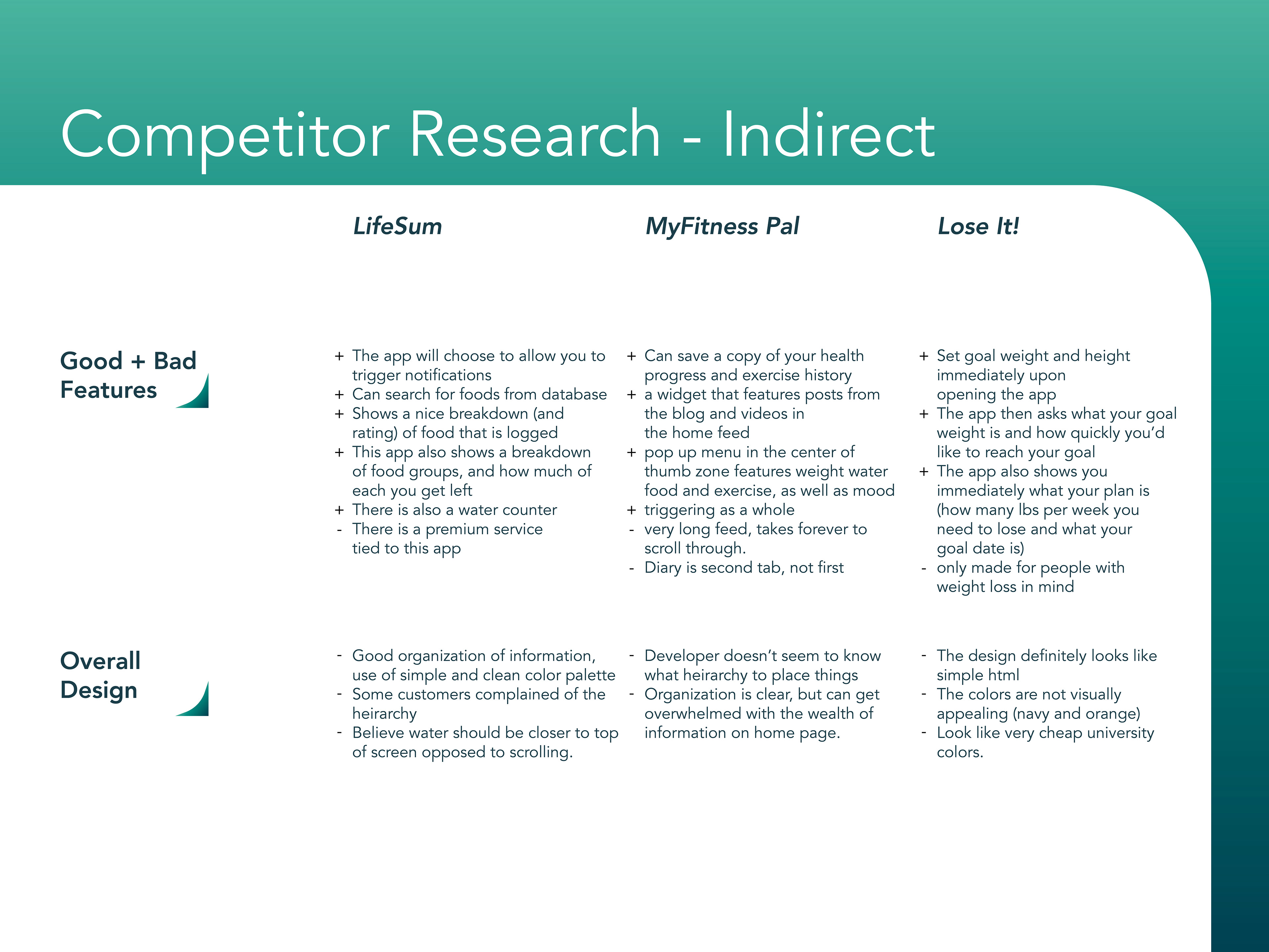
Competitor Research
We reviewed 6 other competitors or services and listed the pros and cons of each to see how our concept would compare to others in the space. Three of them acted as indirect competitors for us to see if apps outside of our direct field may serve the needs of our users. The three direct competitors gave us immediate pain points to consider.

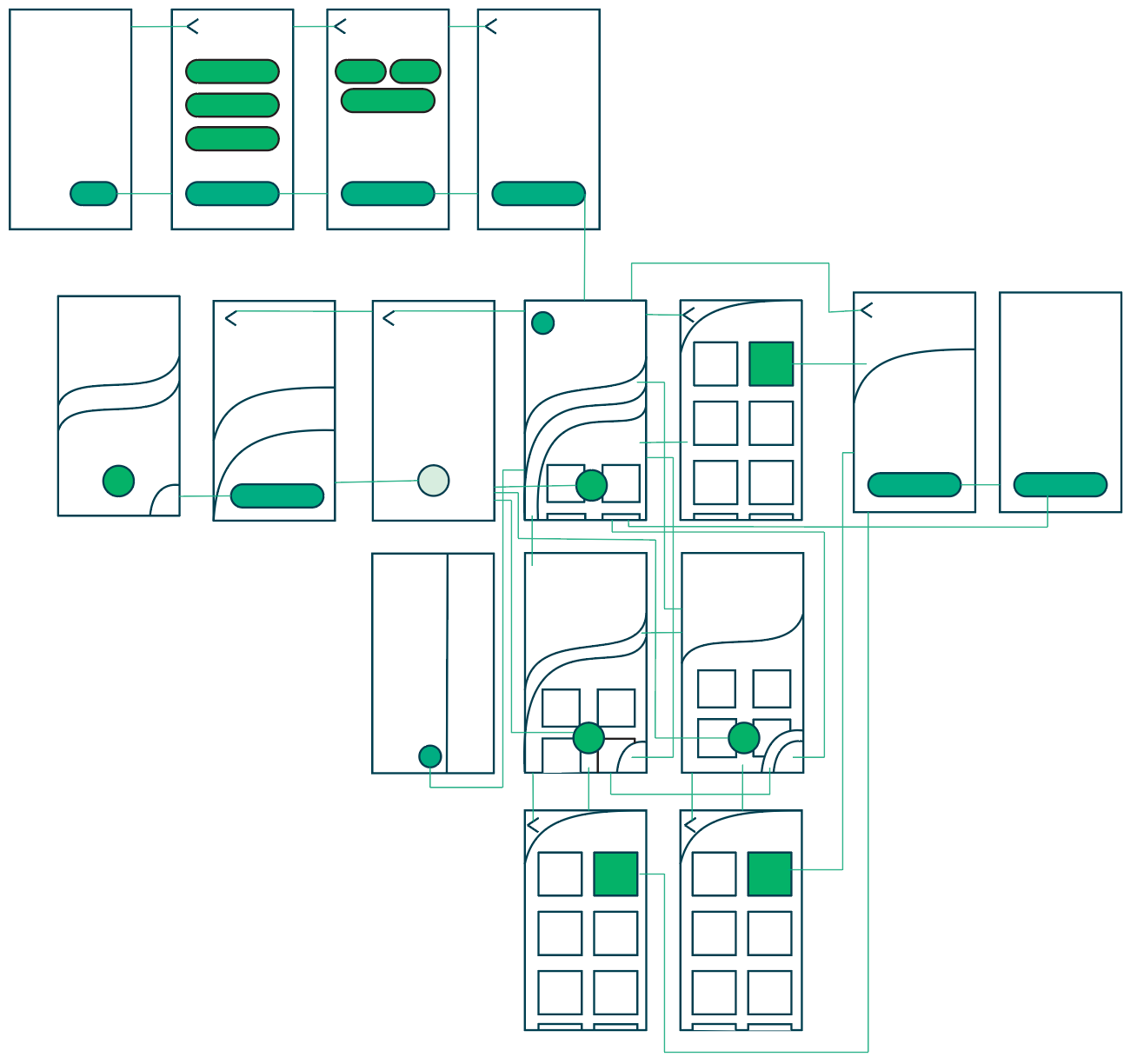
Wireflow
All the necessary pages to convey the application and its functions were planned out in this wireframe. We considered the login process and customization users might require and then the home page followed by the functional pages of previewing meals, logging foods, and editing a users dietary preferences/needs.
Prototype
User Personas: We assigned three personalities for people that might have a need for our application. Each character adopted certain personality traits or needs that we found our app would cater to.
Journey Map: We mapped out a timeline of people using our application and marked the positive points and pain points that were experienced.
Paper Prototype: Before digitally drafting page spreads, we sketched out screens onto paper templates of phones. We added what we thought were the necessary “buttons” and then would give them to people with objectives to complete.
Style Guide
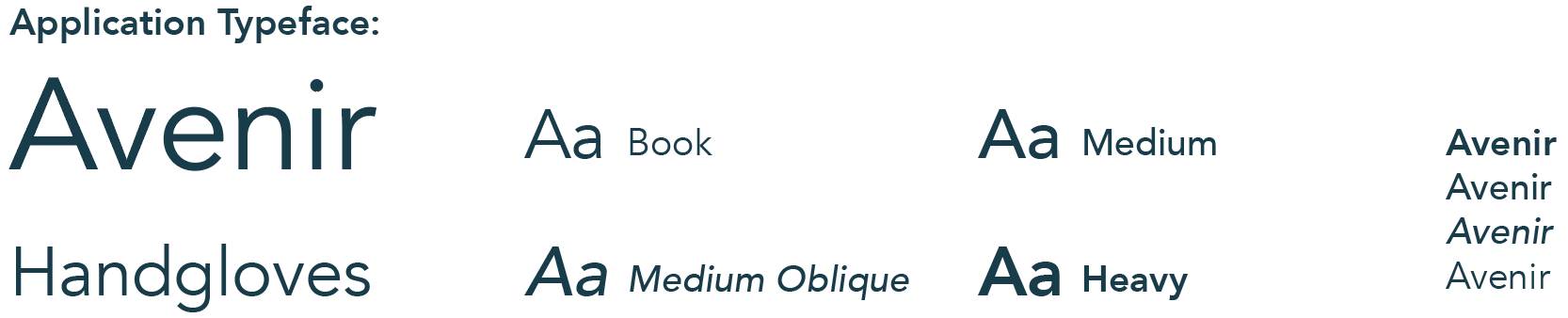
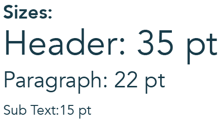
Typography
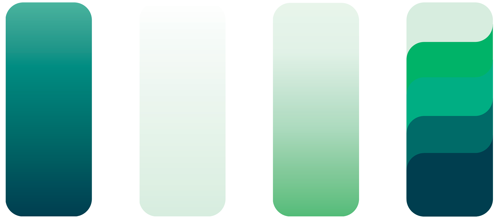
These are the primary colors and gradients we used throughout our branding and application. We wanted colors that felt fresh and invigorating for people to lead a healthy lifestyle.
Colors
These are the primary colors and gradients we used throughout our branding and application. We wanted colors that felt fresh and invigorating for people to lead a healthy lifestyle.
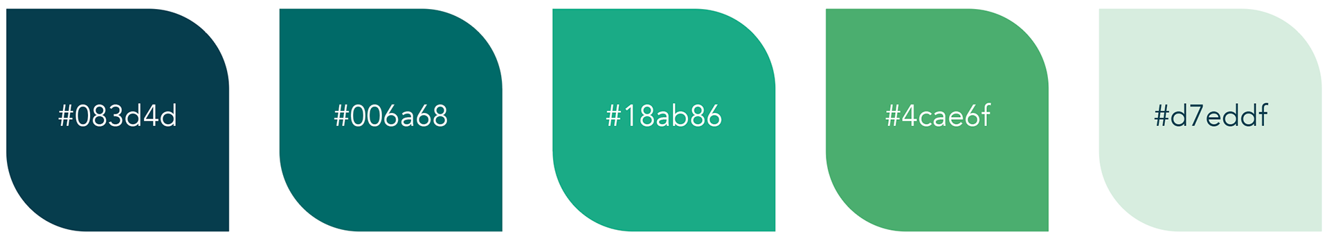
Colors utilized in the primary app screens
Mockups
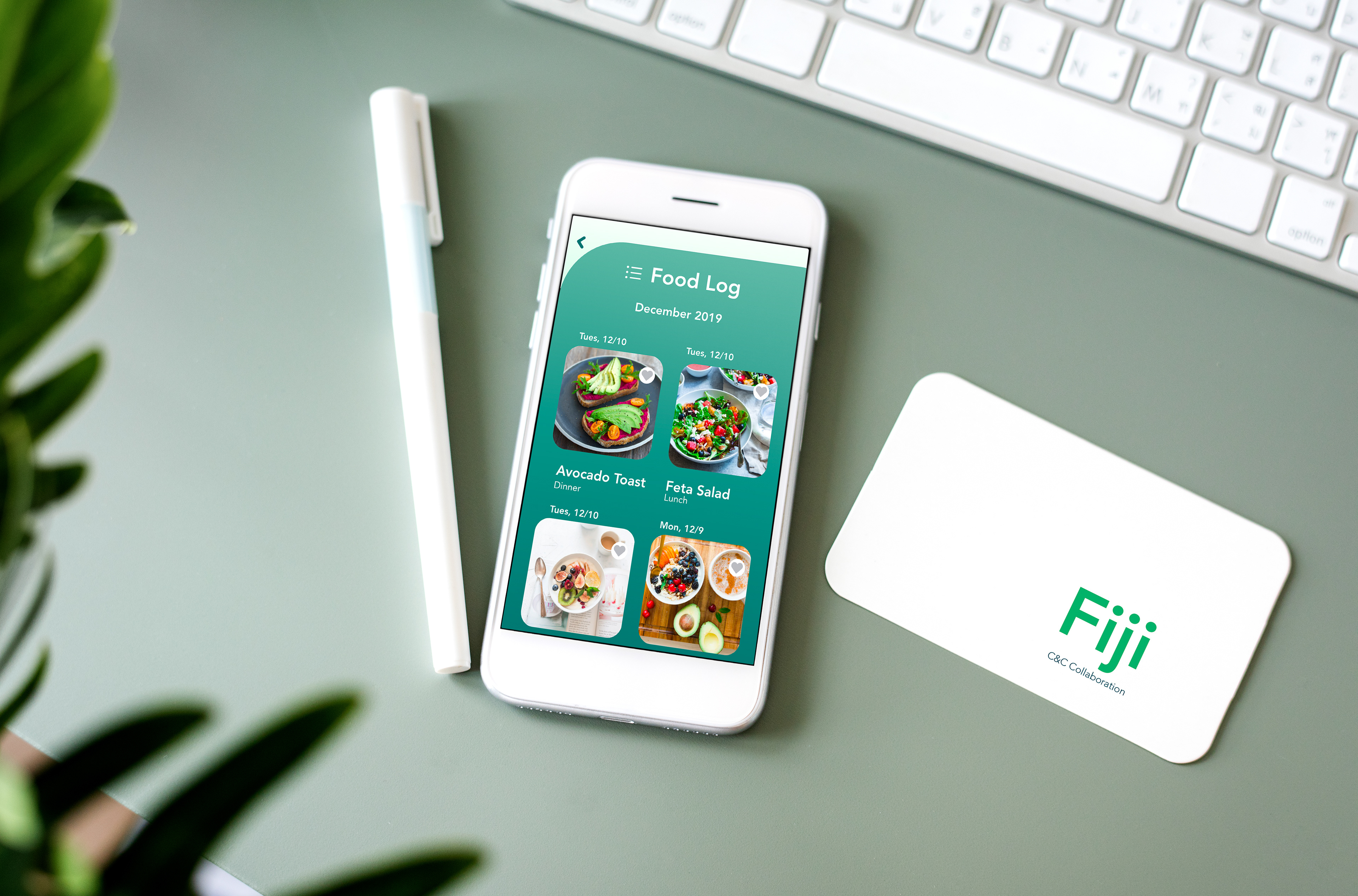
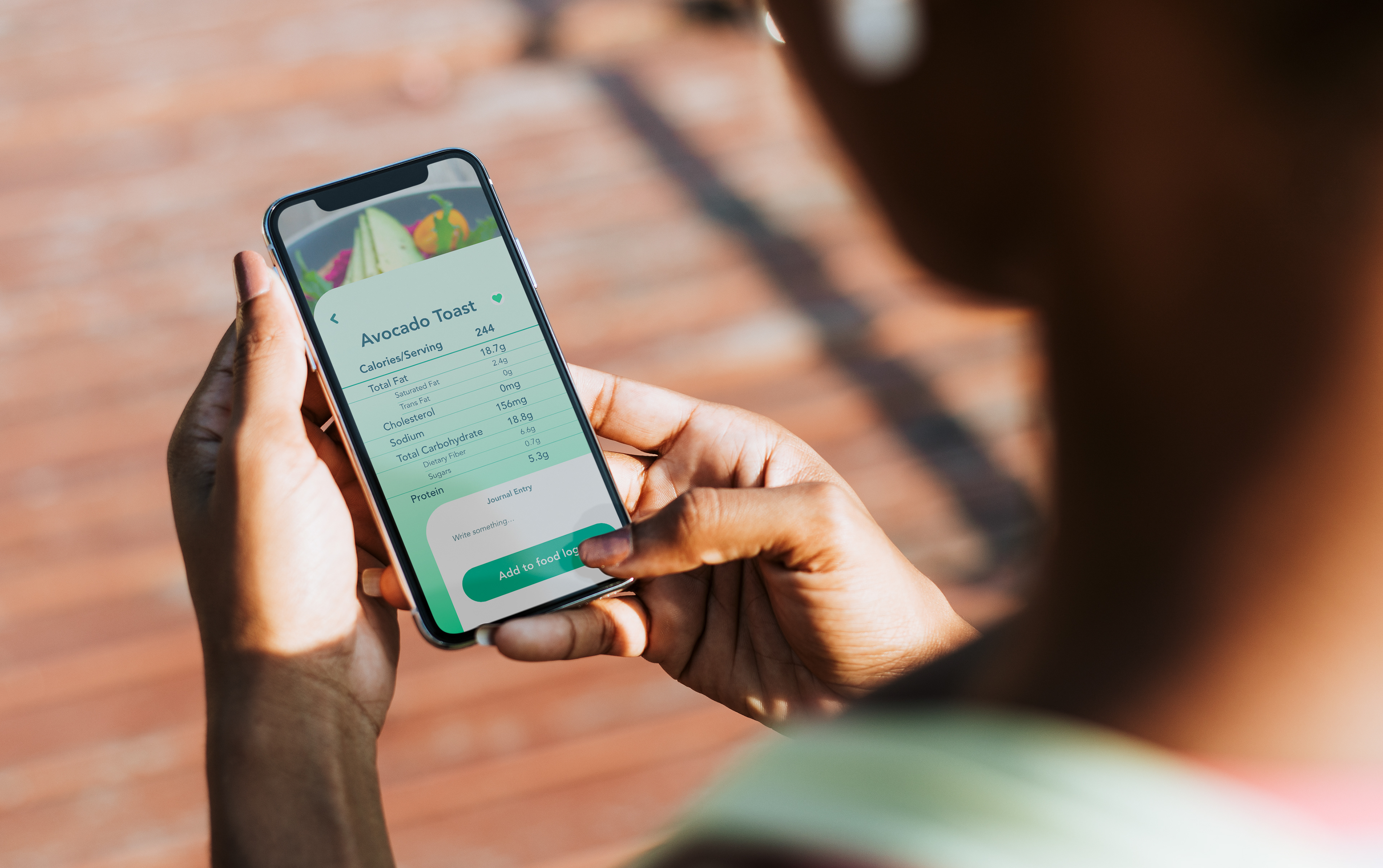
These are real-world mock images of scenarios and devices that our application might be seen in.

Food Nutritional Value Screen
Upcoming Menu schedule
Adding Meal to Food Log

Login Screen
Final