Project Type: Individual Class Project
Class: Design 3503
Teacher: Keith Novicki
Tools Utilized: Illustrator, InDesign
Components: Ideation, Layout, Letterform, Typography
Objective
Assigned one of 16 typefaces at the beginning of the semester, the class was tasked with the thorough
study and exploration of a typeface and the letterforms that occurred within.
The typeface provided to myself was the Neo-Grotesque Sans Serif, Helvetica.
study and exploration of a typeface and the letterforms that occurred within.
The typeface provided to myself was the Neo-Grotesque Sans Serif, Helvetica.
Refining Our Typeface
Letter Spacing
We typed out all of the letters and characters of our typeface into 8x8 square layouts. We were tasked with visually balancing out the characters to practice properly kerning letters on a page.
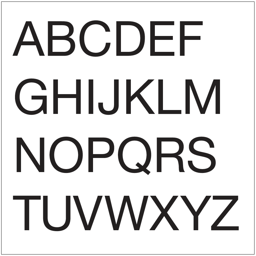
Uppercase Letters
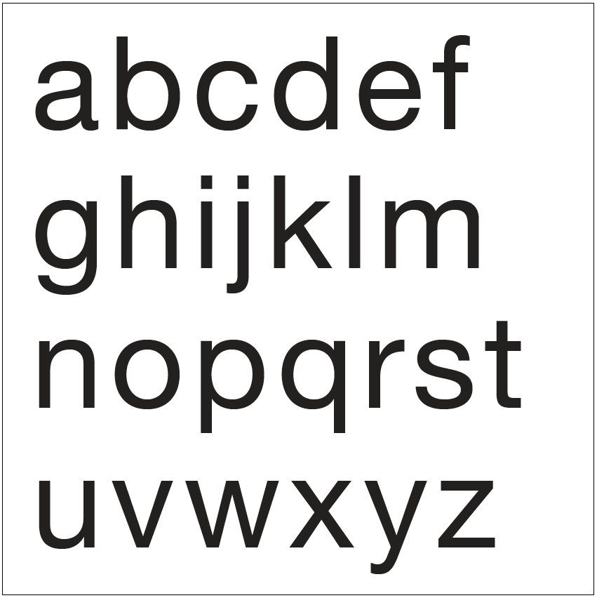
Lowercase Letters
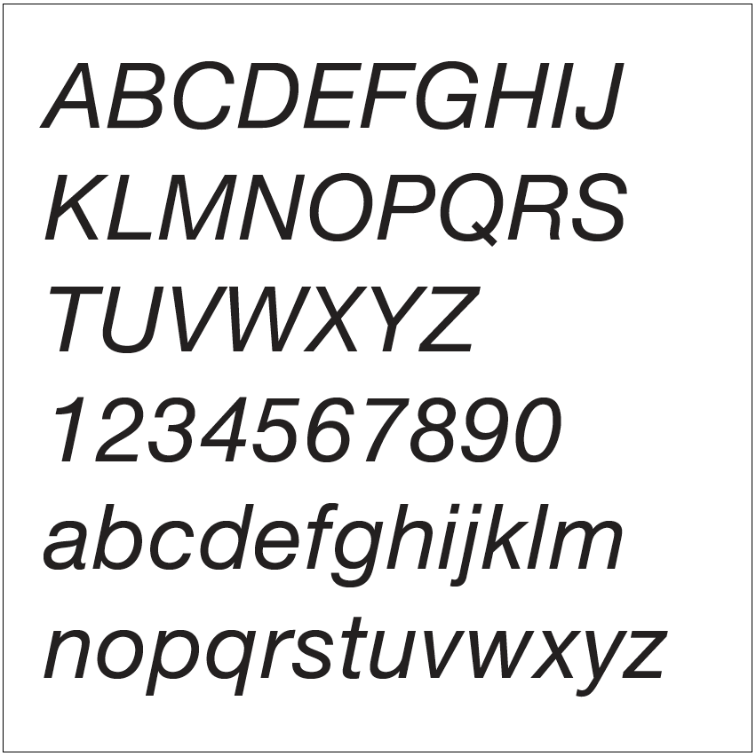
Basic Glyphs Italic
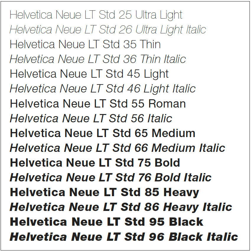
Weights & Versions
Typographic Detail
We chose a character from our typeface and explored the lines and form of them, often moving from heavy abstraction to the reveal.

Abstraction

Clues

Distinction
Reveal
Letterform Sequence
Selected a character and used the positive and negative forms of it to guide eye movement through the strip, slowly revealing the character further.
Typographic Form & Counterform
This was combining the positive forms of two characters or showing how the negative form of one will fit into the positive space of another.
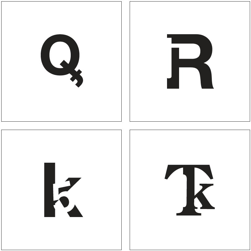
Combine two black glyphs / Combine one black and one white glyph
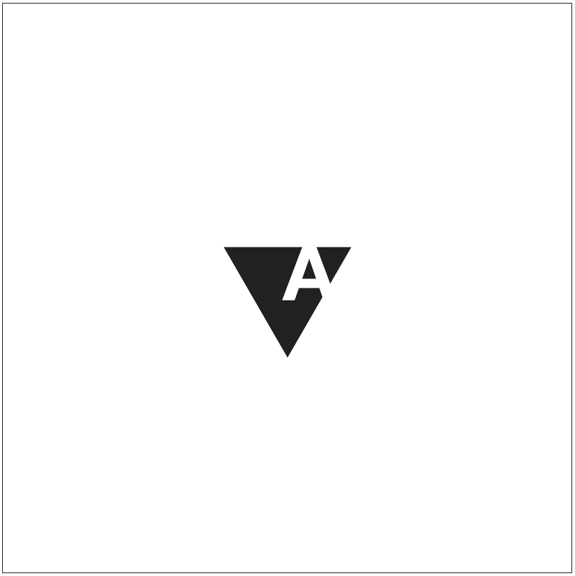
Combine one closed in counterform glyph with a geometric shape
Sentences
Typography
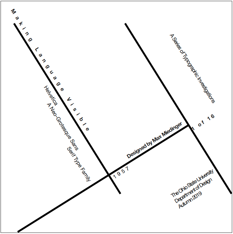
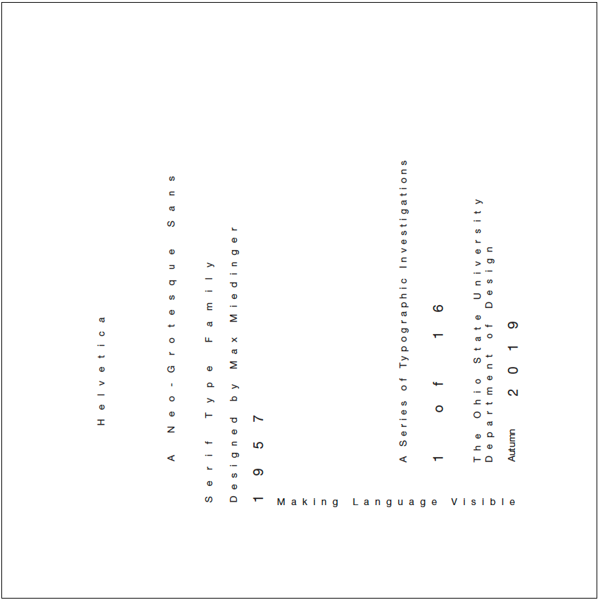
This section had us orienting a sentence describing our typeface in various ways on a square composition, with evolving guidelines for each work.
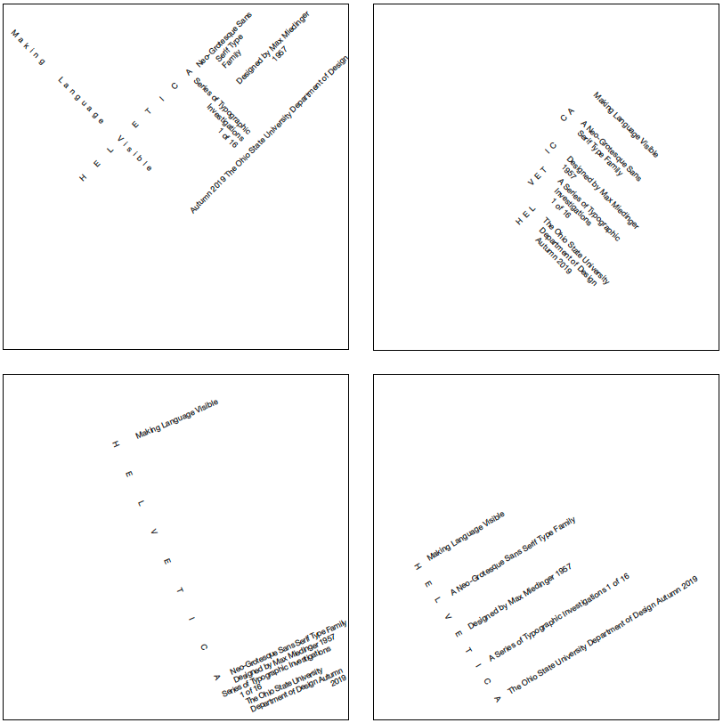
One Size. One Weight. Orthogonal Baselines.
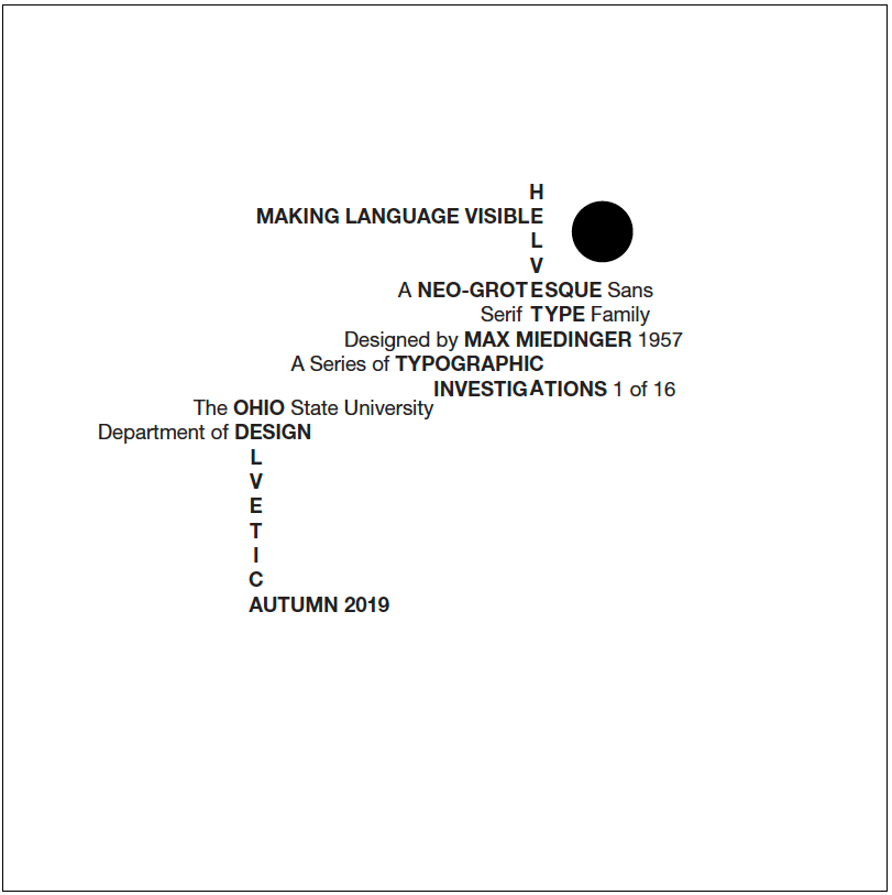
One Size. Two Weights. Horizontal & Orthogonal Baselines. + Circle.
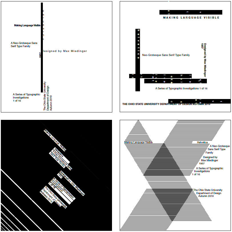
One Size. Two Weights. Two Versions. Horizontal & Orthogonal. + Rules.
One Size. Two Weights. Two Versions. Horizontal & Orthogonal. + Rules.
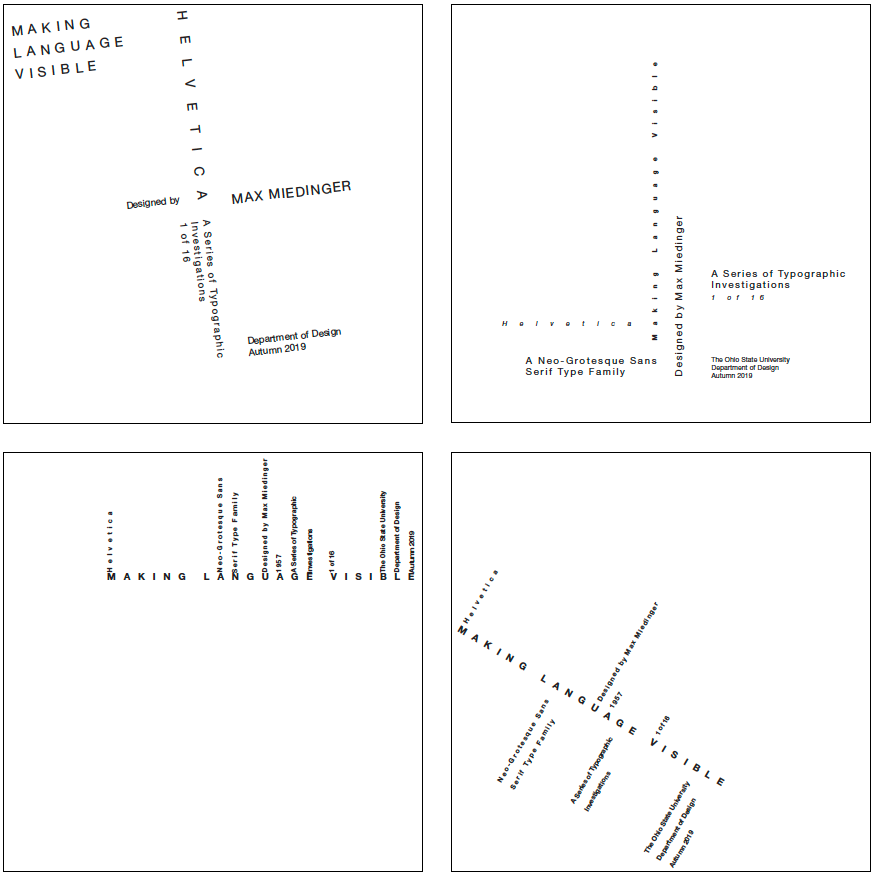
Two Sizes. Two Weights. Two Versions. Horizontal & Orthogonal.
Two Sizes. Two Weights. Two Versions. Horizontal & Orthogonal.
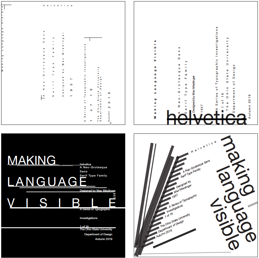
Two Sizes. Two Weights. Two Versions. Rules. Horizontal & Orthogonal. Grey Values.
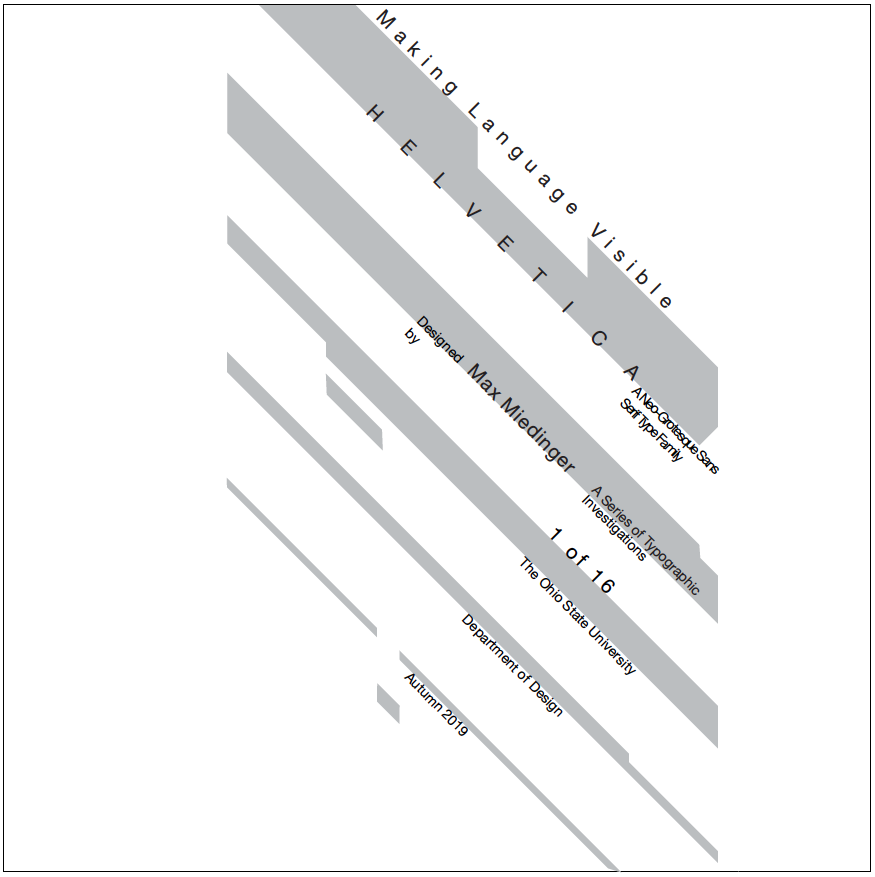
Two Sizes. Two Weights. Two Versions. Rules. Horizontal & Orthogonal. Grey Values.
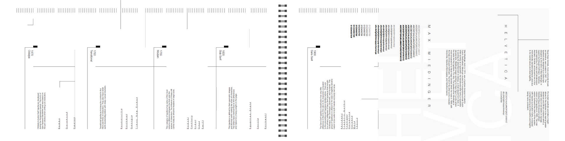
Timeline
A History of Typography Timeline
This was a demonstration of our ability to layout information on the history of typography utilizing our typeface, rules, and orientation. Within each significant point of history, there is a small paragraph detailing the importance of that time and resulting typefaces which emerged then.